
RAY BOWYER
FREELANCE SENIOR GRAPHIC DESIGNER
& ART DIRECTOR
An award-winning Senior Freelance Graphic Designer and Art Director
With over 20 years of experience across the UK, Australia, and New Zealand, I bring a global, versatile perspective
to every project. I've worked in both full-time and freelance roles – within leading creative agencies and
corporate in-house teams – delivering high-impact design across a wide range of industries.
Creative. Strategic. Results-Driven.
Specialising in B2B marketing campaigns, digital builds, branding, identity, print, FMCG packaging, and photography, my skill set spans the entire creative process – from concept development to design execution and finished art. My work has featured across print, digital, television, billboards, and supermarket shelves throughout Australia and New Zealand.
Design with Purpose
Every project is an opportunity to create meaningful, results-focused design. Whether I'm working with a small business
or a global brand, I bring insight, creativity, and a commitment to delivering work that exceeds expectations.
Collaboration at the Core
I believe strong relationships lead to outstanding outcomes. With a personable, collaborative approach, I build
trust with clients and teams – ensuring every project runs smoothly and delivers real impact.
Email: ray_bowyer@yahoo.com Mobile: 07470 896 479
Kingston upon Thames, London KT2 6JT
PORTFOLIO


B2B CREATIVE
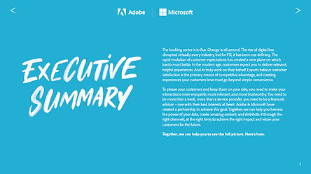
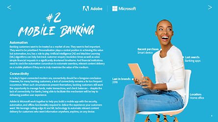
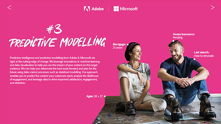
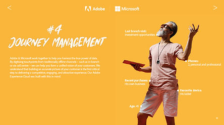
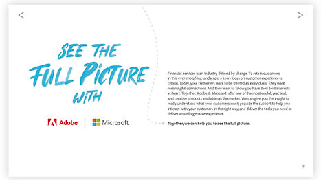
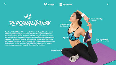
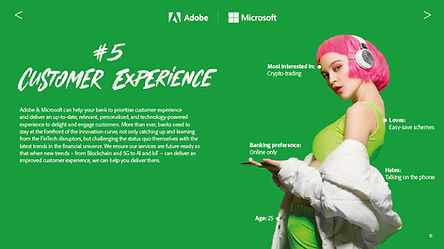
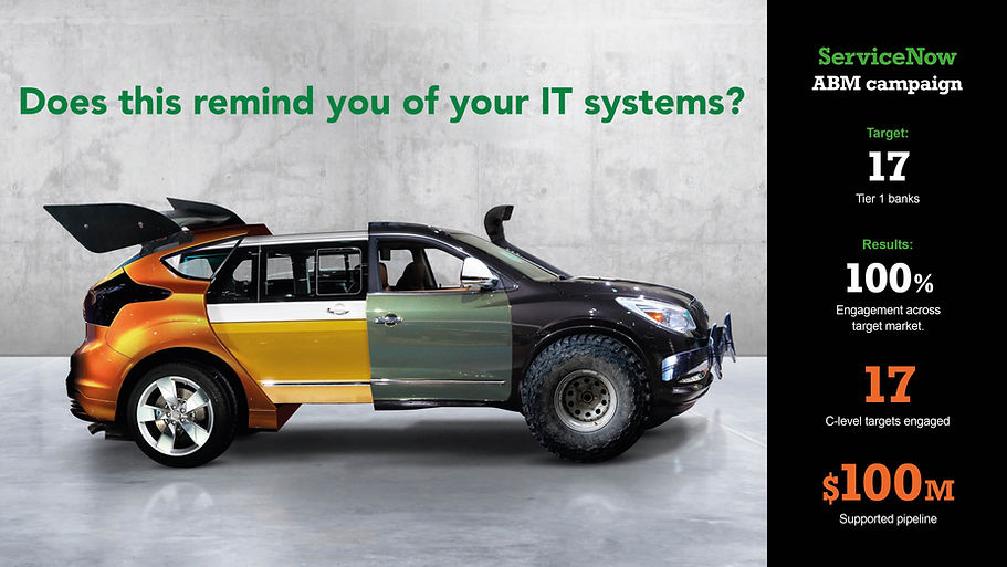
Adobe x Microsoft – 'See the Full Picture'
EMEA marketing campaign focused on customer retention strategies in the banking sector.
As lead Creative, I led the development of a customer retention campaign for a major client in the Financial Services Industry, working closely with our Head of Copy. The goal was to create an engaging, multi-channel experience to strengthen customer loyalty. We delivered a cohesive campaign across social media, animated video, and an
interactive website – resulting in strong audience engagement and improved retention outcomes.

B2B CREATIVE
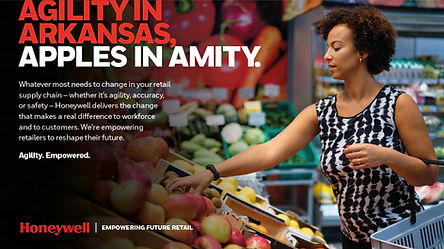
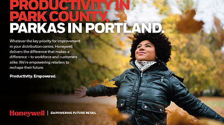

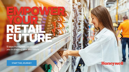
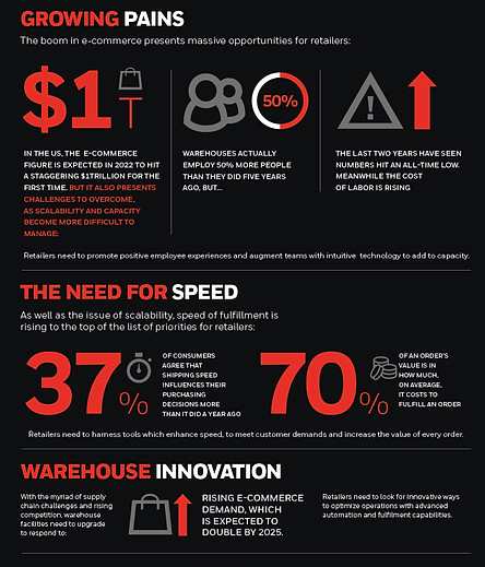
Honeywell – ABM Campaign Targeting Retail & CPG Sectors (US & EMEA)
As Art Director, I collaborated with our Head of Copy to develop the ‘Empowering the Future of Retail’ concept, evolved from our initial creative idea. Central to the campaign, it positioned the customer as the key driver of retail success.
We delivered a multi-channel campaign—including social ads, PDFs, infographics, and an interactive website
– showcasing how Honeywell’s solutions empower customers within the retail ecosystem.
Award-winning: 2024 B2B Marketing Awards Account-based Marketing Campaign
GOLD: ‘Empowering the Future of Retail by Hotwire for Honeywell’
B2B CREATIVE
IDENTITY


Bringing 'Old Vietnam' to North Sydney
I created a full brand experience for a Vietnamese restaurant in North Sydney, inspired by the client’s vision of
old Vietnam. The project spanned brand identity, website, packaging, photography, promotional assets, and
menu design. Every element was carefully crafted to blend traditional cultural motifs with a clean, modern
aesthetic – resulting in a cohesive identity that resonates with both local and international audiences.

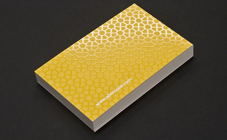
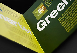
Defining a Clear Identity for Silex Solar
I was tasked with developing a brand identity that clearly communicates the core business of Silex Solar, a solar panel manufacturing facility. To achieve this, I designed a bold, modern icon paired with a panel-inspired pattern, intended for consistent use across all stationery. To elevate the brand further, I applied a spot UV treatment to the business cards
– highlighting key elements and adding a premium, tactile finish.


THE ARTISAN STOREROOM
I created a minimalist brand identity for a Melbourne homewares and art store, focusing on clean typography
and a black-and-white palette. A matte seal adds a tactile, premium finish, reinforcing the
brand’s commitment to simplicity and quality.
BRANDING


La Famiglia Style Guide
Developed a comprehensive brand and style guide to ensure consistency across new product packaging for La Famiglia. After leading an extensive redesign of the entire packaging line, I consolidated visual elements into a cohesive system, providing a clear blueprint for future packaging designs and other brand touchpoints.
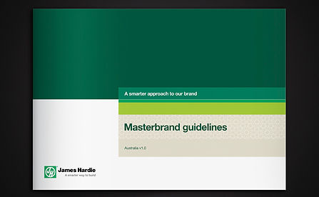
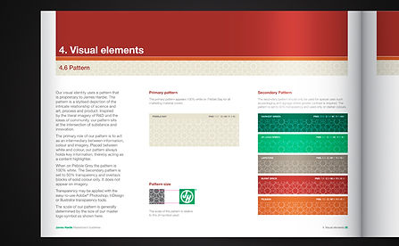
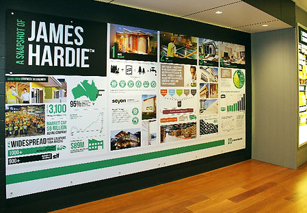
James Hardie Masterbrand Guidelines
Following the introduction of the new brand position, "A Smarter Way to Build", we were commissioned to
create an entire library of marketing templates and integrate them into a robust set of master brand
guidelines. This initiative aimed to streamline James Hardie's marketing
communications across a variety of platforms and materials.


Prostate Cancer Foundation of Australia
The brief was to extend PCFA’s branding to generate more interest and variety. I expanded the colour palette from a
single blue to a range of shades, providing greater flexibility to convey different messages while maintaining strong
brand recognition. This extended palette allows for a cohesive yet versatile identity across all marketing materials.


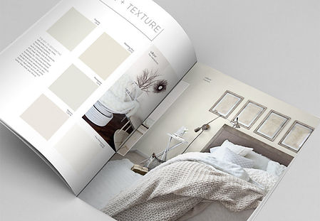
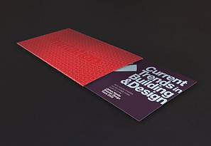
ESQUE (Baresque publication)
As part of a team, I designed and produced a high-end publication to position Baresque as a leader in
commercial interior design, with a focus on wall coverings and unique products. This bi-annual book was
crafted to be a sophisticated, standout piece, distinct from a typical product catalogue,
reflecting the brand's innovation and expertise in the industry.
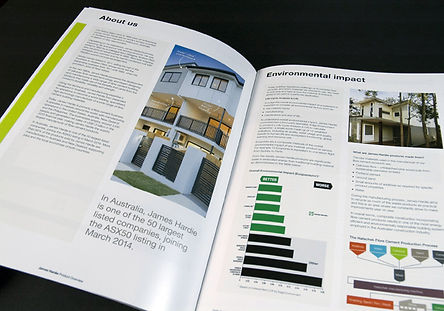
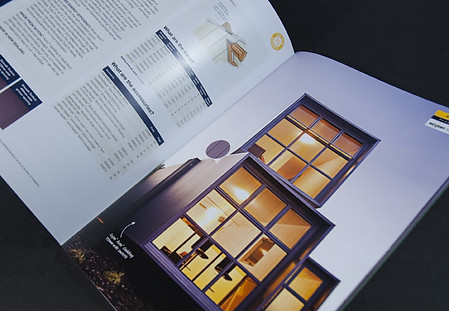
James Hardie
I designed a brochure to integrate James Hardie's core product and Scyon ranges into a unified catalogue,
featuring a refreshed look and feel. The result is a revitalised design that emphasises white space and highlights
product photography. A new branding bar device is prominently featured throughout the design.
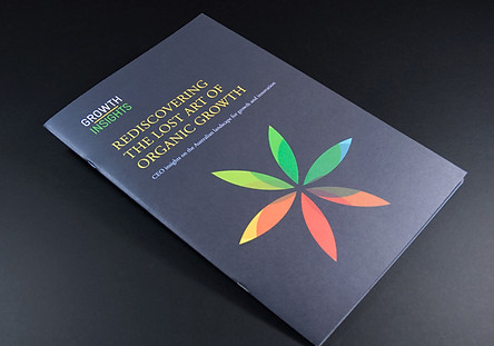

ThinkGrowth
The task was to deliver a standout report based on findings from a survey conducted across ASX100 companies.
Each set of responses was meticulously analysed and reinterpreted to craft visually engaging infographics
that go beyond traditional charts and graphs, offering fresh and impactful insights.
PACKAGING


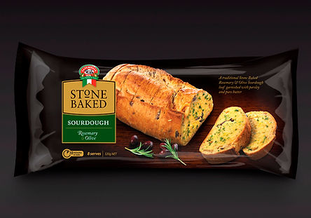
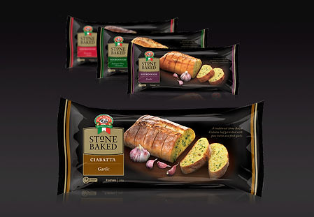
La Famiglia & Stonebaked
I helped develop a range of garlic and flavour-based breads for the chilled section, including an Everyday Range
with white packaging and a Select Range with coloured packaging, both featuring authentic Italian branding.
I also contributed to the design of Stonebaked, a premium range with gold and black packaging to
stand out in the market. To differentiate SKUs, we used a colour-coding system.

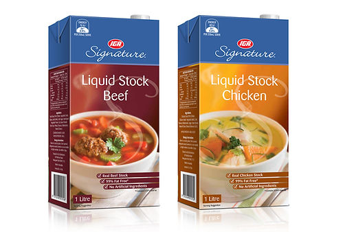
IGA Signature
IGA Signature products are instantly recognizable thanks to a sleek metallic signature band across all packaging. This distinctive design not only enhances shelf visibility but also signals premium quality. With a focus on sophisticated packaging, expert food styling, and high-quality photography, each product delivers a cohesive, visually appealing
brand experience, making it easy for customers to spot and trust the IGA Signature range.
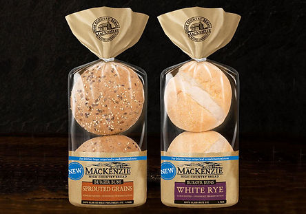
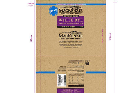
Goodman Fielder (MacKenzie bread)
I designed and produced the artwork for the new range of MacKenzie burger buns, ensuring the packaging
aligns with the established look and feel of the current MacKenzie bread and muffin split range.
ADVERTISING
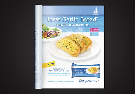
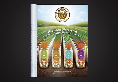
Weight Watchers & Country Life Bakery
Developed a targeted ad campaign to introduce a new "lighter" variant of garlic bread.
Additionally, I created a trade ad to support the relaunch of the Country Life Bakery range.
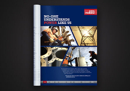

John Holland Energy & Resources
The brief was to develop a sophisticated, flexible advertising template that reinforces the strength of John Holland's
brand while allowing for the personalised marketing of individual business units. The result will be a series of
cohesive, high-impact advertisements that highlight both the individual expertise of each unit
and the collective strength of the John Holland brand.


Valspar Paints
My brochure design successfully differentiated Valspar’s superior paint range from its competitors, with an
emphasis on premium aesthetics and product benefits. They became a key marketing asset that
resonated with consumers, helping to elevate Valspar's presence in a crowded marketplace.
DIGITAL

James Hardie 'Scyon'
I helped the mobile site for Scyon provided users with an intuitive, frictionless experience, allowing them to easily explore the brand’s product offerings and make informed decisions. By keeping the design simple yet effective, we increased user engagement and improved conversion rates, helping the Scyon brand strengthen its presence in the digital space.

James Hardie
The brief was to develop an internal electronic newsletter for staff. The template was created using the James Hardie
style and colour palette. The design is easily updatable from month to month with new images and content.

OnceLife
On-brand email marketing campaign for life insurance.
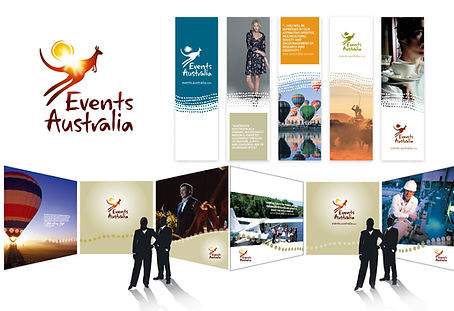
TRADE & EVENTS


James Hardie
I collaborated with a team to create a dynamic exhibition space for James Hardie products at Queensland's
Design & Build Centre. Named the Home Design Hub, the space showcases home design ideas with branded
lightboxes, infographics, and product installations. The design offers visitors a clear understanding
of James Hardie's products and their benefits in a visually engaging and informative setting.
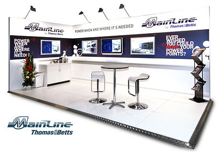
Thomas & Betts / Tourism Australia
Further trade event concepts and design.
PHOTOGRAPHY


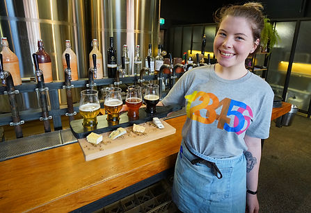


Various projects
In addition to design, I simply love photography. I’ve setup a few in-house studios over the years and have experience
in food styling and art direction. This is just a small selection of what I have shot over the past several years.
ADDITIONAL PROJECTS
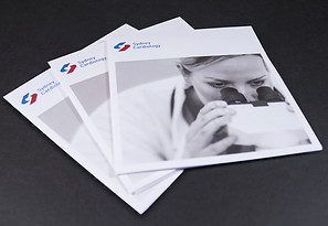
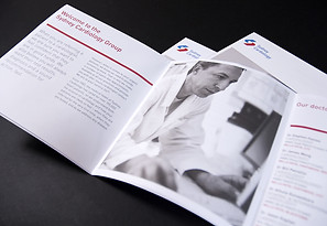

Sydney Cardiology
I created a leave-behind for GPs to give a snapshot of Sydney Cardiology, portraying their clinical excellence to generate patient referrals. A fold-out poster reveals the information in a clear and concise manner. Black and white photography
and limited colour throughout creates a professional, stylish and striking piece.
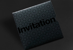
James Hardie
Range of invites for special events targeted to architects and builders.